When the Chicago Bulls hit the floor for the upcoming season, you’ll notice some differences in the United Center.
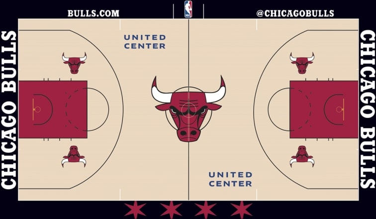
On Wednesday the Bulls unveiled their new court design for the season which features some homage to the city of Chicago throughout the design. The most notable difference is the four Chicago stars located on the baseline, a major change from just the black baseline the team has had since the 1996 season. The new look will also help incorporate the “Chicago Basketball” campaign the team has started.
The Bulls' new court design. pic.twitter.com/9kf1FSUUj6
— RealGM (@RealGM) September 23, 2015
Bulls.com has more:
The iconic bull head logo at center court has increased in size by 75 percent and the image of a basketball that was previously behind the logo has been removed. The “CHICAGO BULLS” text on the endlines has been changed to the font used in the official Bulls logo to make the court design more consistent with the Bulls brand, and the same font has been applied to the “Bulls.com” and the “@ChicagoBulls” text on the north apron of the court.
I will say that the new design is very sleek and impressive. I never thought the Bulls would change the look of the traditional court, but they did and they did it the right way.
For More Great Chicago Sports Content
Get the latest Chicago sports news, analysis, and breaking stories on the Bears, Bulls, Blackhawks, Cubs, White Sox, Sky, and more! Tap the star to add us to your favorites on Google News, so you never miss a story on your favorite Chicago teams.
Follow us on Twitter at @chicitysports23 for more great content. We appreciate you taking time to read our articles. To interact more with our community and keep up to date on the latest in Chicago sports news, JOIN OUR FREE FACEBOOK GROUP by CLICKING HERE


